Blogs Understand Cohort Analysis
Cohort Analysis is a term used extensively in customer research of businesses, especially the SaaS ones. What does it mean? And how important is it in data analytics? Follow the article below to understand more.
What is cohort analysis?
Cohort analysis is a technique for tracking a group of people who share a common characteristic within a selected period - a set of buyers who made their first purchase during a Black Friday campaign on an e-commerce platform in 2021.
Why is cohort analysis important?
In this competitive market, not only attracting new users is essential, but retaining existing customers and encouraging them to continue using your products is critical as well.
In such cases, Cohort analysis is helpful for companies because it helps measure:
- The progress of funnels over time
- The number of users retained in a specific period
- The impact of recent changes to your products on user behaviour
Besides, Cohort analysis separates growth metrics from engagement metrics, which will help businesses avoid overlooking the lack of activity of old users due to the impressive growth of new users.
How to read and interpret a cohort chart?
There are many ways to visualise cohort charts. Still, the most common and useful method is using two-dimensional heat maps whose cells are coloured based on their values.
Let’s learn using cohort analysis with an example – a monthly cohort of users who have accessed a website the first time and revisited it in the next 11 months.
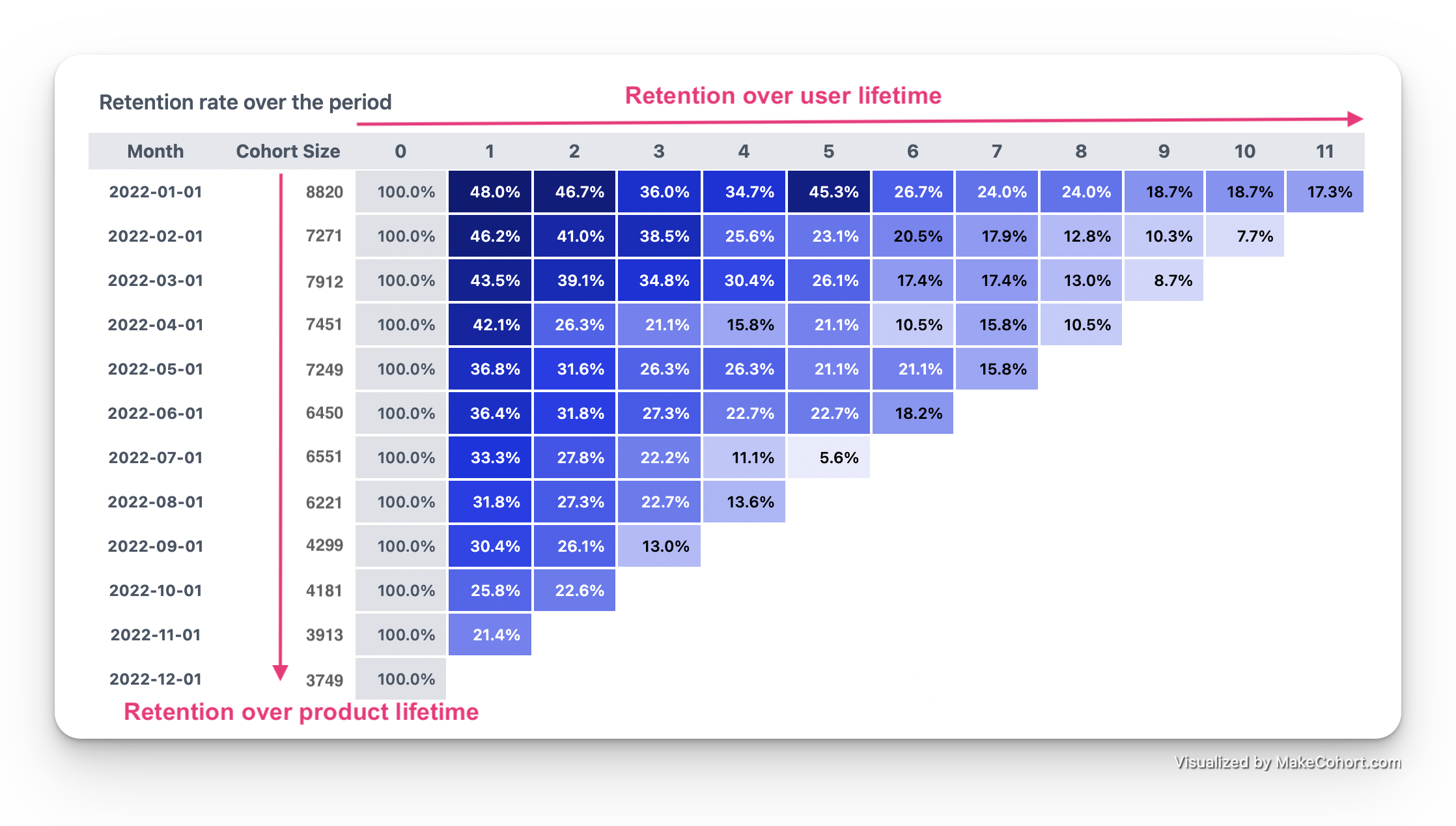
From the above cohort chart, we can infer the following:
- Read horizontally from left to right (user lifetime): 8,820 new users visited the website in Jan 2022. In the 1st month after the acquisition date, retention was 48.0%. In the second month, it decreased to 46.7%. After one year, 17.3% of users were still active on this website. This might be a good signal depending on their target of annual retention and market comparison.
- Move vertically from top to bottom (product lifetime): Retention started at 48% in Jan 2022 and ended at 21.4% in Dec 2022. Companies definitively expect this metric to be stable throughout the period. Because if the retention declines after a while, it implies that they have not done well in making customers stay recently.
- Abnormal points: The percentage of customers staying in the 5th month from the first visit date in January had a sudden increase while before that it decreased steadily. This is uncommon behaviour and worth looking into.
Conclusion
Now that we’ve gone through the concept and importance of Cohort Analysis, it's time to apply it to each business domain. In reality, you will likely have to remove beforehand the outliers, seasonal factors of the year, etc., for more accurate analysis results. Finally, let MakeCohort.com help you draw a nice cohort chart.
Thanks for reading!